Neo 2 Field Report: What a 5.94 cm/pixel Mapping Result
Neo 2 Field Report: What a 5.94 cm/pixel Mapping Result Teaches Us About Coastal Power Line Monitoring
META: A field-based expert article on using Neo 2 for coastal power line monitoring, with practical tips on EMI handling, orthomosaic accuracy, obstacle awareness, and workflow lessons drawn from a 1 km² GS Pro mapping result.
Coastal power line work punishes weak flight planning.
Salt haze softens contrast. Wind changes direction without warning. Reflective water and wet ground can confuse visual positioning. Then there is the issue many pilots underestimate until they see it in flight behavior: electromagnetic interference around transmission infrastructure. If you are evaluating Neo 2 for monitoring work in this environment, the useful question is not whether it can fly near utility assets. The better question is how to structure a mission so the imagery remains usable for inspection, mapping, and repeatable condition checks.
A reference case from a DJI GS Pro orthomosaic workflow offers a surprisingly grounded benchmark. In that report, a 1 square kilometer survey area delivered quality rated as good, with a ground sampling distance of 5.94 cm/pixel, noted as better than 6 cm. The output was a GeoTiff Image Map and Esri Mosaic Dataset, referenced in WGS 84 / UTM zone 4, and the report states the result overlaid well with a satellite basemap in ArcMap. Those details matter far more than they may seem at first glance, especially for coastal corridor inspection.
Why? Because power line monitoring is not just about seeing a tower. It is about building a workflow where the drone, the imagery, and the GIS all agree on where that tower actually is.
Why this reference result matters for Neo 2 users
The GS Pro report is not about Neo 2 specifically, but it gives us a hard operational target: sub-6 cm orthomosaic resolution across a real survey block, and outputs that align properly in a GIS environment. For anyone planning to use Neo 2 around coastal power assets, that is the standard to think against.
A 5.94 cm/pixel result means each pixel on the final map represents just under 6 centimeters on the ground. For broad corridor review, site access checks, drainage observation around pylons, vegetation encroachment trending, and documenting erosion near utility foundations, that level of detail is very workable. You are not replacing close visual component inspection of insulators or connectors with an orthomosaic. You are creating a dependable spatial layer that helps a utility team answer different questions:
- Has the terrain around the structure shifted?
- Is the service road still accessible after tidal weather?
- Is vegetation pressure changing along the route?
- Are there signs of standing water or washout near support assets?
- Does the line corridor still match previous survey alignment in the GIS?
That distinction is where many drone programs either become useful or become expensive photo collection exercises.
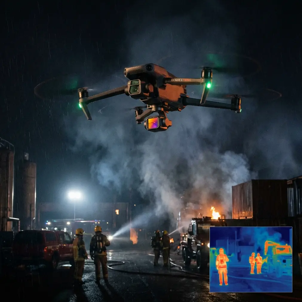
The coastal power line reality: EMI changes how you fly
Around power lines, electromagnetic interference is rarely dramatic at first. It often shows up as small, annoying inconsistencies: heading drift, hesitation in orientation, occasional compass warnings, or a strange mismatch between what the aircraft thinks is straight and what the pilot sees on screen. In a coastal zone, this can stack with wind gusts and lower-contrast surfaces, making a simple route unexpectedly messy.
My field habit with Neo 2 in these conditions is straightforward: if the aircraft begins showing unstable directional behavior near line infrastructure, I increase stand-off distance and reassess antenna orientation before assuming the aircraft is the problem.
That antenna adjustment sounds basic, but in practice it is one of the easiest ways to stabilize the link in a noisy environment. The goal is not just signal strength. It is consistency. Pointing the controller antenna properly relative to the aircraft’s position, instead of casually flying with poor orientation, can reduce unnecessary fluctuations at the exact moment you need confidence near linear assets. This matters even more over coastal corridors, where the pilot may already be contending with wind-driven lateral drift.
The key operational takeaway is simple: when EMI is present, do not force proximity to get the shot. Back off, clean up the link, re-establish geometry, and let the mission objective dictate the distance. For mapping and site documentation, stable data beats aggressive positioning every time.
Neo 2’s role: not just inspection footage, but structured monitoring
People often approach compact drones as if they are built only for quick visuals. That is too narrow. For coastal power line monitoring, Neo 2 becomes valuable when used as part of a layered workflow.
A useful mission split looks like this:
Overview pass for corridor context
This is where broad mapping logic applies. You want consistent overlap, a predictable route, and imagery that can be assembled into a spatial product.Targeted observation pass for assets of interest
Once the map or overview identifies tower pads, shoreline exposure, access track issues, or vegetation anomalies, a second pass can document them with more intent.Repeatable revisit workflow
The real value emerges when the same site is flown again after storms, seasonal change, or maintenance events.
That is why the reference report’s GIS alignment detail is so useful. It states the resulting mosaic overlaid well with a satellite basemap in ArcMap. For a utility team, that is not cosmetic. That is the difference between “nice drone imagery” and “data that can be compared against existing asset layers.”
If Neo 2 imagery is going to support coastal power line decisions, the output must fit into the existing map ecosystem. Utility managers do not need random video files. They need imagery that can sit inside a geospatial workflow beside tower IDs, easements, vegetation boundaries, flood zones, and access routes.
What “good quality over 1 km²” really tells us
The report’s summary says the survey area was 1 square kilometer and that quality within the area was good. That scale matters.
One square kilometer is large enough to move beyond a demo flight. It suggests a workflow capable of handling a meaningful operational block rather than a single isolated structure. For coastal power line monitoring, that means you can think in sections: one crossing, one substation perimeter, one shoreline-adjacent support cluster, or one vulnerable access segment.
The lesson is not that every Neo 2 mission should cover exactly 1 km². The lesson is that quality at area scale depends on discipline:
- consistent image capture
- controlled speed
- enough overlap for post-processing
- stable positioning despite interference and wind
- careful geospatial export choices
The reference also lists 37,707 matched points in processing. Even without over-reading one software report, that is a useful indicator of image-to-image correspondence. In plain terms, the software had plenty of visual tie information to work with. For coastal utility environments, that means your capture strategy must help the processing engine find common features despite repetitive terrain, reflective surfaces, and sparse landmarks.
This is where pilots make or break the result. If you fly too fast, vary altitude without reason, or let yaw drift during collection, the software has less clean geometry to build from. The final map suffers. The field team then blames the drone, when the real issue was mission consistency.
Obstacle avoidance and subject tracking: useful, but not interchangeable with planning
Neo 2 discussions often drift toward features like obstacle avoidance, subject tracking, ActiveTrack, QuickShots, and Hyperlapse. These are relevant, but only if framed correctly for infrastructure work.
Obstacle avoidance helps reduce the risk of unintended proximity events around poles, towers, and nearby vegetation. That said, utility corridors are not a playground for trusting automation blindly. Thin wires, complex tower geometry, and changing light can still demand conservative standoff and manual judgment.
Subject tracking and ActiveTrack are better thought of as documentation aids than primary inspection logic. For example, if a maintenance crew is moving along a coastal access route and you need contextual footage showing road condition, shoreline encroachment, or worksite progression, tracking can help produce clean supporting visuals. But I would not treat it as a substitute for a structured asset capture plan around power infrastructure.
QuickShots and Hyperlapse are even more niche in this context. They are not core inspection tools. Still, they can be useful for stakeholder communication. A short, stabilized site progression clip or time-compressed view of tidal movement around tower access points can help non-pilot decision-makers grasp environmental conditions quickly. In utility operations, communication value should not be dismissed. Sometimes the most effective deliverable is the one the asset manager understands immediately.
D-Log in coastal inspection: not cinematic, practical
D-Log gets associated with creative shooting, but in a coastal monitoring setting its value is more practical than artistic.
Coastal scenes often combine bright sky, reflective water, pale concrete, dark vegetation, and metallic structures in one frame. That dynamic range can challenge standard profiles. If your purpose is documenting corrosion patterns, shoreline wear, staining, or subtle surface changes around support structures, preserving tonal detail helps. D-Log gives the analyst or editor more room to recover highlight and shadow detail later.
Again, this is not about making the flight look dramatic. It is about making sure the recorded scene contains enough usable information for review.
Geospatial discipline: the underrated part of Neo 2 utility work
The reference data includes one quiet but essential detail: WGS 84 / UTM zone 4 as the spatial reference. Many drone operators overlook this part entirely until the output lands in the wrong place inside a GIS project.
For power line monitoring, correct spatial reference handling is operationally significant because utility data rarely lives in isolation. The imagery may need to align with asset inventories, shoreline change layers, engineering drawings, prior flight datasets, and third-party basemaps. If the coordinate system is mishandled, trust in the drone program evaporates fast.
That is why the ArcMap overlay note in the report deserves attention. Good overlay with a satellite basemap is not just a nice check box. It is evidence that the imagery can enter a broader asset management conversation.
If your Neo 2 workflow ends with “we got some good photos,” you have only solved half the problem. If it ends with “the imagery aligns in GIS and supports repeat comparison,” now you have built something a utility team can use.
Practical coastal mission tips for Neo 2 around power lines
Here is how I would translate the reference case into field behavior:
1. Treat resolution as a planning metric, not a bragging point
The report’s 5.94 cm/pixel output is useful because it ties image detail to a real survey outcome. Before launch, define what the team needs to detect. Erosion and access-route washout need different framing than hardware condition checks.
2. Expect EMI and plan for stand-off
Do not improvise this after the warning appears. Build flight paths that allow separation from energized infrastructure. If control behavior becomes inconsistent, adjust antenna orientation, re-center the link, and widen your buffer.
3. Use overview mapping to prioritize detailed follow-up
A corridor-level image product helps identify where a second pass is actually worth flying. That saves time and reduces unnecessary exposure to difficult airspace around structures.
4. Keep outputs GIS-ready
Export discipline matters. A GeoTIFF that drops cleanly into the mapping stack is far more valuable than disconnected stills sitting in a folder.
5. Don’t over-trust automation near utility assets
Obstacle avoidance is an aid. It is not permission to fly casually near lines, lattice structures, or guy wires.
6. Use D-Log when contrast is working against you
Coastal light is often harsh and deceptive. Preserving image latitude can make later review noticeably more useful.
The bigger lesson from the GS Pro reference
What I like about this reference is that it is modest. It does not promise miracles. It shows a workflow that covered 1 km², achieved better than 6 cm resolution, produced a GIS-friendly map product, and held up well enough to overlay against a basemap.
That is the mindset Neo 2 operators should borrow for coastal power line monitoring.
Not spectacle. Reliability.
When a drone program supports utility work, the best flights are often the least dramatic ones. The aircraft behaves predictably. The pilot respects interference. The imagery processes cleanly. The final map lands where it should. And the next time the team flies the same corridor after a storm, they can compare change instead of starting from scratch.
If you are shaping a Neo 2 workflow for coastal power lines, anchor your expectations in results like this. Aim for repeatable image geometry, practical spatial accuracy, and disciplined field handling around EMI. If you want to compare notes on corridor setup or signal-management habits in this kind of environment, you can message the flight team directly here.
That is where Neo 2 stops being a small drone with attractive features and starts becoming a credible tool in a real infrastructure workflow.
Ready for your own Neo 2? Contact our team for expert consultation.